Holographic Card 3D — Framer Tilt Card Component with Foil Sheen
A Framer marketplace component for 3D tilt cards with holographic foil and parallax layers. Drop-in for pricing tables, hero cards, and portfolio tiles.
Category:
Framer
Author:
Umut Sevinc
Time:
2 mins
Date:
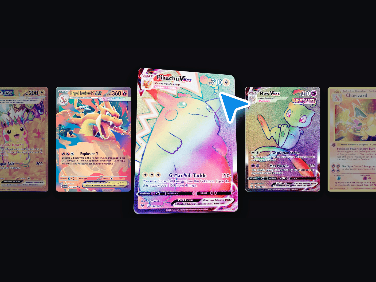


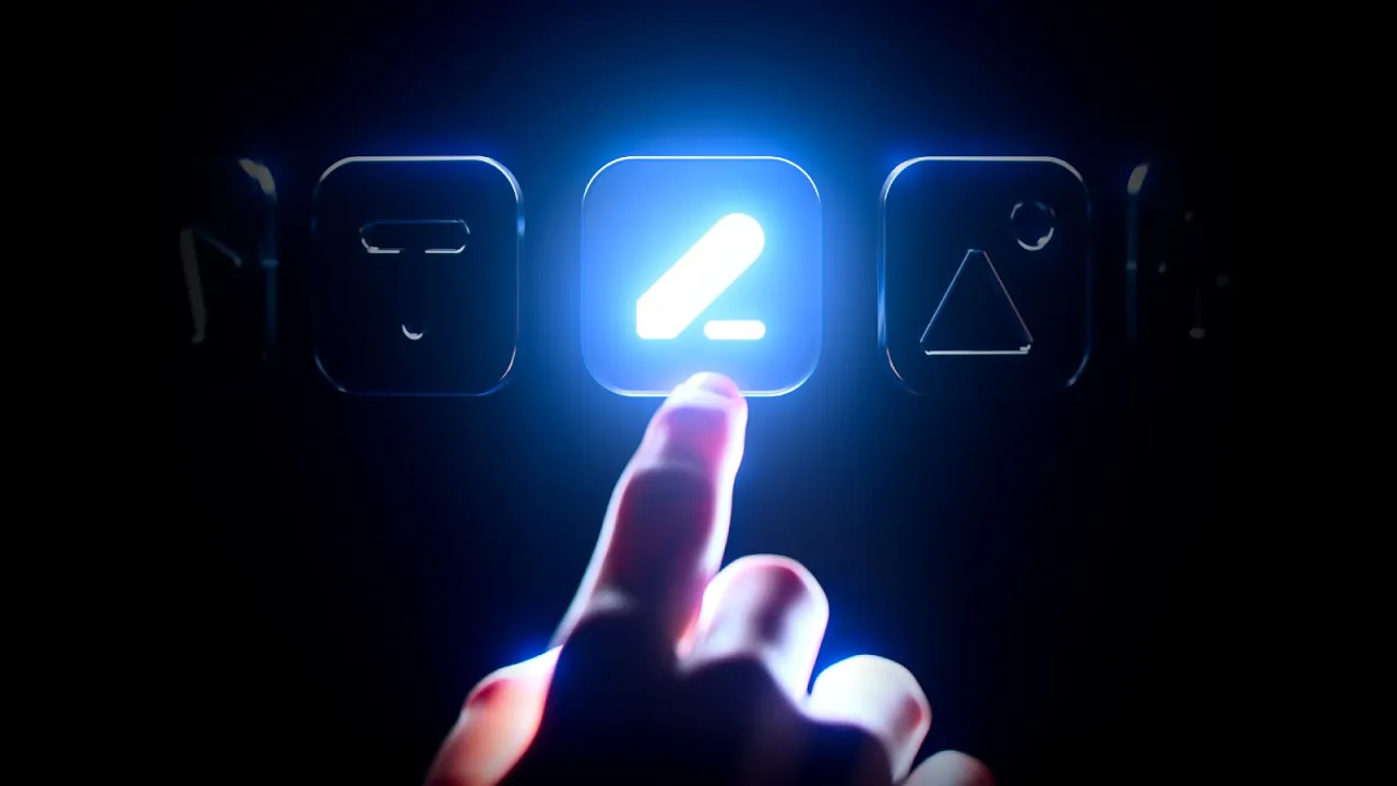
A premium interactions component for Framer. Cards tilt on hover, a holographic highlight tracks the cursor, and foreground layers separate from the background for a real parallax effect.

TL;DR
3D tilt-on-hover card with cursor-tracked holographic sheen.
Configurable tilt intensity, foil colour, and parallax depth.
Best for pricing tables, hero feature cards, and portfolio grids.
What Holographic Card 3D Does
The component wraps any card content — an image, a title, a price, a button — and applies a tilt transform tied to cursor position. As the visitor moves the pointer across the card, the card rotates on its X and Y axes. A holographic gradient highlight follows the pointer, mimicking the foil on a high-end trading card. Inner layers (image vs. text vs. CTA) shift at slightly different rates, creating depth.
On touch devices, the effect downgrades gracefully — usually to a subtle gyroscope-driven tilt or a static fallback.
Why Use It
Hero sections and pricing rows are the most cloned blocks on the modern web. A tactile, physical-feeling card is one of the few things that still earns a stop-scroll. It signals craft without needing copy: the visitor's hand finds the card, the card responds, and the section reads as "this team cares about details".
Pain points it solves:
Pricing tables that all look identical across SaaS sites.
Hero product mockups that feel like static screenshots.
Portfolio tiles that compete for attention with no visual hierarchy.
Features
Cursor-tracked 3D tilt with adjustable intensity and damping.
Holographic foil highlight that tracks the pointer.
Multi-layer parallax — pass background and foreground content separately.
Customisable foil colour, blur radius, and reflection angle.
Touch fallback with reduced or static behaviour.
Honours
prefers-reduced-motion.Works with Framer's link, hover state, and component prop system.
Three Use Cases
1. SaaS pricing page, top tier. Apply the component to the highest pricing plan only. The visual separation does the work of saying "this is the one" without copy gymnastics.
2. Indie product hero. Replace a flat hero screenshot with a holographic card containing the product mockup. The card becomes the hero, and the rest of the page can stay restrained.
3. Portfolio case study grid. Studios with five to twelve case studies can drop the component on each tile. Hovering across the grid feels like flipping through a deck.
How to Install in Framer
Open the Holographic Card 3D marketplace listing.
Click Insert to add the component to your Framer project.
Drop the component onto your canvas, sized to your card footprint.
Use the slot props to pass in your image, title, body, and CTA.
Tune tilt intensity, foil colour, and depth in the properties panel.
Preview to confirm the parallax and foil feel right at your card size.
Ship It
Install Holographic Card 3D from the Framer Marketplace.
Back to the full kit: Best Framer Components 2026 →